Ohio University
Graphics Dress Up Ohio University Arena
by Kevin Hoffman, Managing Editor of Coach & AD Magazine. October 2014
Ohio University’s Convocation Center was built more than 45 years ago, but few would ever suspect it. Over the last decade the venue has been upgraded with everything from video boards to “television quality lighting,” creating an atmosphere unlike anyone would expect from such an aged facility.
That doesn’t mean improvements weren’t needed, and high above the floor where cameras and eyes rarely venture, the university wanted a fresh look.
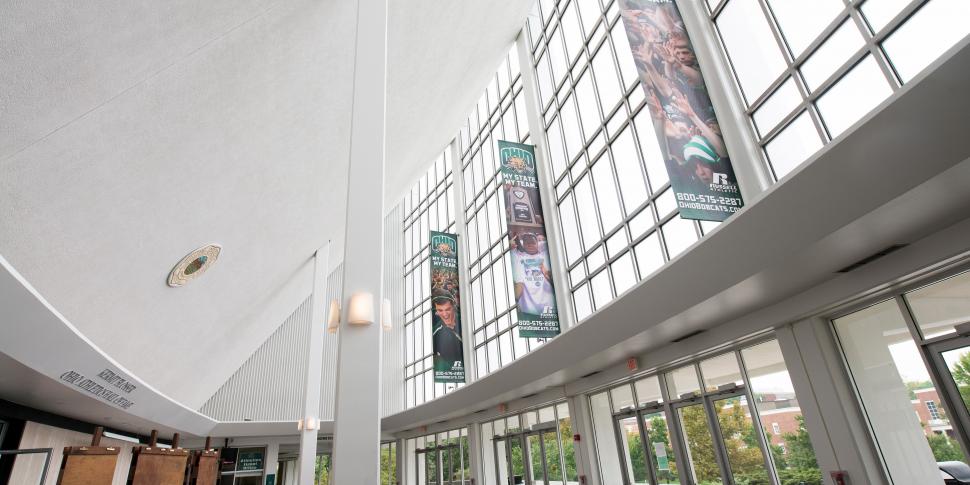
“One of our most unique projects was hanging graphics around the inner rings of the catwalk,” said Drake Bolon, the athletic program’s director of marketing and sales. “We can’t say enough about how great they look and they really fill in the arena and add in a great visual piece to space that was pretty empty for awhile.”
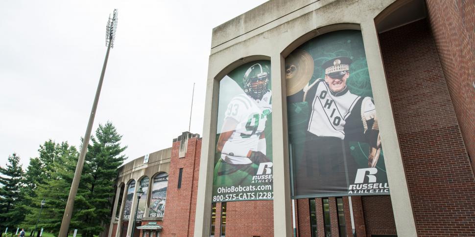
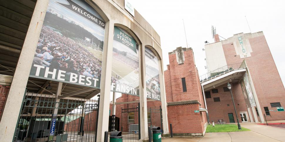
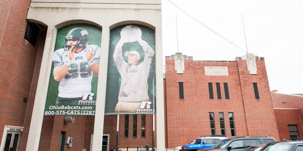
The gym graphics project with BigSigns. com was just a small piece of a major renovation that’s taking place at the Convocation Center over a five-year period. Each year will come with small, incremental upgrades that involve concession stands, locker rooms, athletic offices and seating. They’re also hanging BigSigns.com graphics at the football stadium façade, adding another visual element to one of campus’ most popular facilities.
On its surface raising a few banners seems like a simple project, but to athletic department officials it was anything but. The university purchased banners as big as 10 feet in length, so design and construction came with a lot more obstacles than one might expect.
“It was an instance of dotting all our i’s and crossing all our t’s,” Bolon said. “It was something we hadn’t done before in measuring something like that, and I can’t tell you how many times we went around and checked our measurements. If you were off by a couple of inches, it just wouldn’t look right out there.”
More universities and high schools are placing a greater emphasis on aesthetic appeal, whether it’s geared toward branding or just finding a unique way to create more excitement among fans and student-athletes. This project is expected to do both, and Bolon said he’s already received positive feedback from those fortunate enough to get a sneak peak at the Convocation Center’s new look.
Fans didn’t get to visit the arena for an event until early September when Ohio University’s volleyball team hosted Texas A&M. The men’s basketball team’s home opener is Nov. 8 against Marietta College.
Bolon anticipated students would approve of the upgrades. His department already posted a picture of the changes on Facebook and he said it was the most “liked” image in the history of its page. “They’re just clamoring to see the facility upgrades,” he said. “We also did a time lapse video of the installation and put that out there and a lot of fans have been viewing that and commenting on it.”
Planning for a project like this requires great attention to detail and an eye on the bigger picture. Bolon said it was critical that he keep in mind the fact that the graphics would hang in the Convocation Center catwalks for more than 20 years, so they wanted to decorate them with images that would last. Many of them walk the traditional route, displaying the school name and logo. Others include phrases like “Home of the Bobcats,” or “Stand up and cheer,” which is a reference to the university’s fight song.
A lot of thought went into those details, including fonts and graphics, because one small mistake could derail the entire project and force designers to re-do the graphics. Bolon cautions others undergoing similar projects to put a lot of consideration into the images they use. You never know what might change.
“Make sure it’s timeless, and a lot of us at our level have to be careful what we put up there,” he said. Images of coaches or student-athletes could serve as an embarrassing reminder if they were to leave for another school. “It gets real expensive to replace those.”
Bolon also recommended that schools think outside the box. Hanging graphics around the catwalks was Ohio University’s way of adding more appeal to its arena while filling empty space, but other athletic programs may have their own opportunities to improve the look of their facilities. That’s especially important for colleges hoping to land prized recruits.
“We’re very excited about this, and it’s going to be a big deal to our fans, students and student-athletes,” Bolon said. “We’re going to keep trying to make this great arena even better and with this renovation the Convocation Center is going to be a force to be reckoned with for years to come.”


